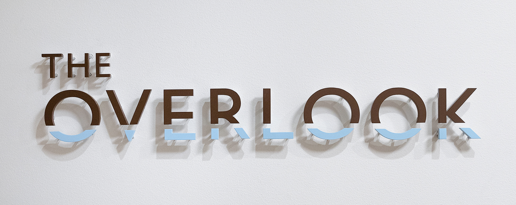
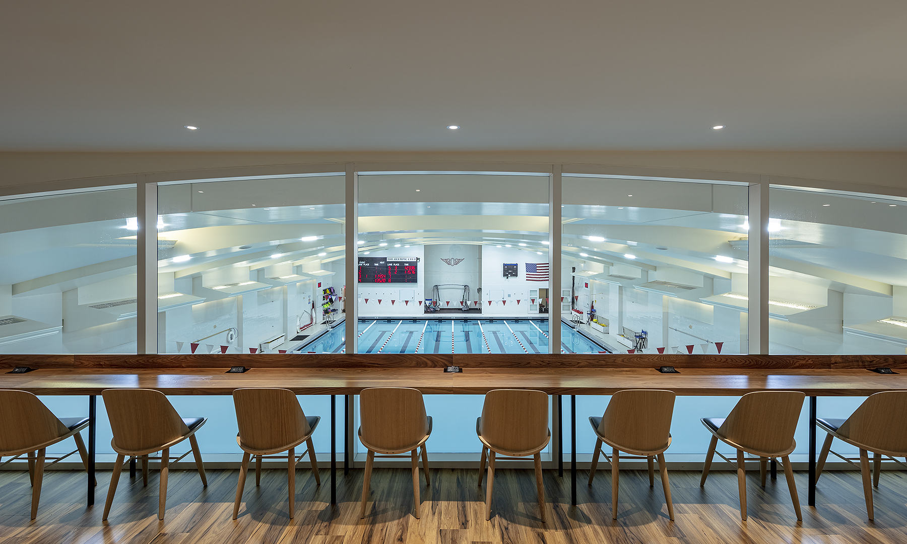
For the renovation of the café at our Club, we held a naming contest and members chose “The Overlook,” because the space overlooks our pool. I designed the logo for the new restaurant with the bottom of the letters imitating the pool.


For a look into the process of creating the logo, I started by sketching different ideas.

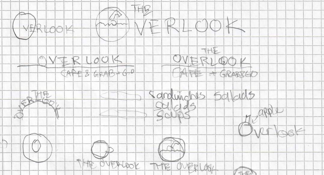
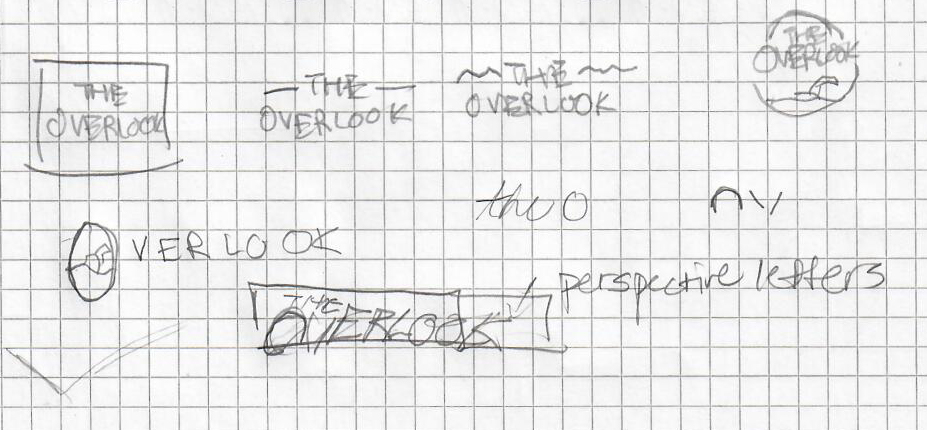

Then I took my favorite ideas and created comps on the computer. Here are some of the alternate designs that I explored.
As we reviewed those concepts, we liked the first idea where the bottom of the words “The Overlook” were cut off. During the discussion, I wondered what if I combined the first concept with the last concept, where the blue box ran across the bottom of the words. So I split the words, and made the bottom blue, which communicated much better.
Then, I took the concept and explored it using different fonts.
This led to the final version of the logo, which was brought to life in a sign for the restaurant. The logo, and the restaurant, have received overwhelmingly positive feedback.
Company: Olympic Club